MOST SUITABLE ENERGY STORAGE TECHNOLOGY
The first technical result was the selection of the most suitable energy storage technology. Although the Power rating of the Flow batteries is the lowest one out of these three, this characteristic did not have a significant effect on the case study.
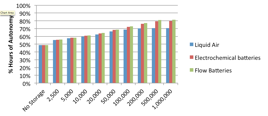
As we can see in figure 1, the highest percentage of autonomy achieved with all the different capacities was for the flow batteries technology. This means the flow batteries increased the time over a year when the factory was autonomous. This autonomy did not keep increasing proportionally to the increase of the capacity. There was a limit which was visible after 200,000 kWh for the Liquid air energy storage technology. The other two energy storage technologies reached this limit with higher capacities due to their efficiencies. After this point the autonomy remained stable because the surplus is limited.
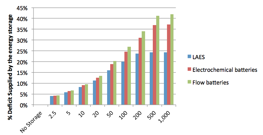
Figure 2 shows the percentage of the deficit that was supplied by the energy storage technology. Flow batteries again proved to be the most suitable energy storage technology because of they achieved the highest percentage of energy supplied to the factory.
SCENARIOS
All the different scenarios have been done using liquid air energy storage technology (LAES) at its maximum capacity, 200 MWh. This energy storage technology has been chosen as an example. The results with either of the other two technologies would be better than this one, with the same capacity. To view the effect of changing the characteristics of the energy storage technology download the program in the modelling section.
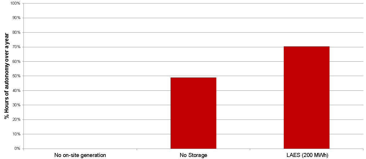
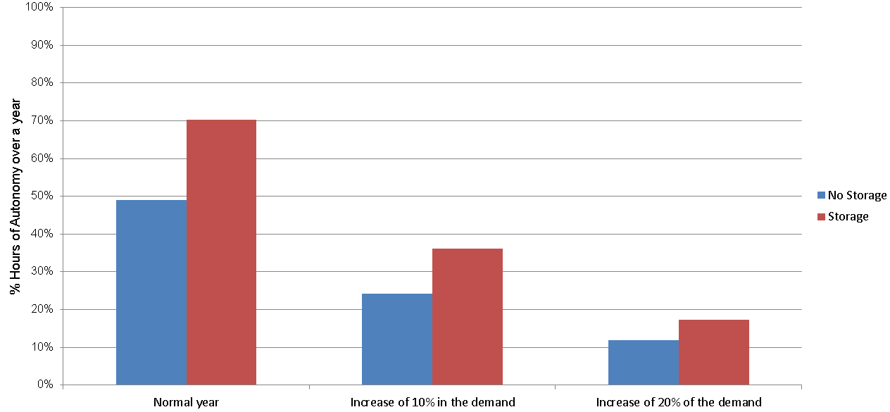
Before looking at the different scenarios, it is a good idea to show how effectively the energy storage technology (LAES, 200 MWh) works. The amount of hours the site was autonomous increased by 20% when the storage was implemented.
Increase in the demand
The figure 3 shows the drop of the percentage of hours over a year when the factory is autonomous as a consequence of an increase in the demand. An increase of 20% of the demand results in a dramatic drop for the percentage of hours when the factory is autonomous, from 70.32% to 17.35%. However, the factory still increases its autonomy in this case due to the energy storage technology from 11.9% (No Storage) to 17.35%.
On-site fault
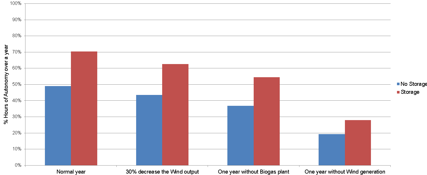
In this case, the different scenarios analysed over a year are a fault in the biogas plant and the wind turbines and a reduction in 30% of the wind generation due to a low wind speed year. A fault over a year in the biomass plant will mean the factory is not autonomous, depending on the imported electricity every day. This means that it is not protected from grid blackouts or rota-disconnections at any time.
A fault over a year in the biogas plant decreases the percentage of hours when the factory is autonomous to less than 20%. Turning off the four wind turbines over a year produces a drop around 40% of the hours of autonomy. Anyway, the increase of autonomy in this last case by implementing the energy storage is almost 10%.
Maintenance periods
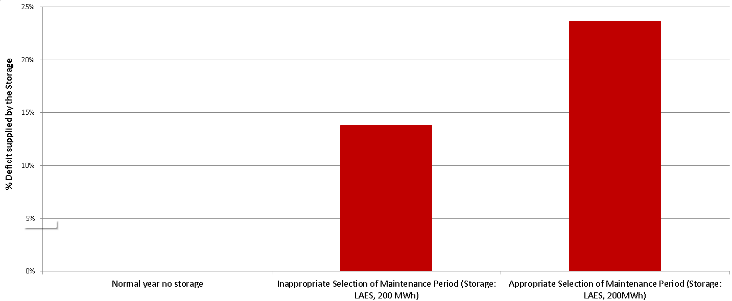
In this scenario the appropriate maintenance period has been selected for the Biomass and Biogas plant during low peaks of demand and for the Wind turbines in periods of low speed wind. The inappropriate one has been selected all at the same time during a high period of wind speed. This graph shows the percentage of the deficit supplied by the energy storage technology over a year.
Almost 10 % of the energy supplied by the storage can be increased with a suitable selection of the maintenance periods.
Emissions
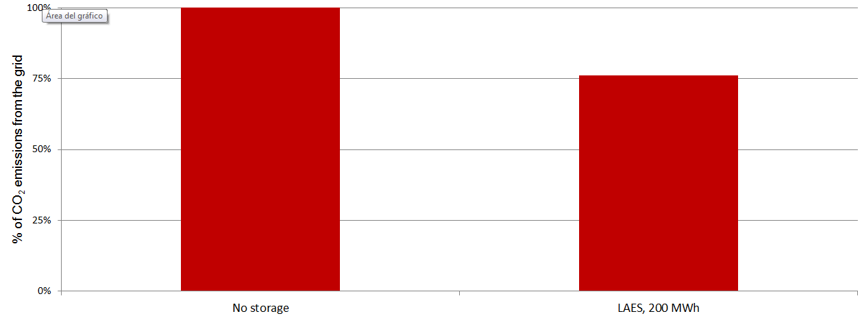
This graph shows how much emissions can be saved by the energy storage technology reducing the imports from the grid. With no storage all the deficit between the demand and the on-site generation must be supplied by the grid. The energy supplied by the grid comes from different sources, renewables and non-renewables, and there is always a significant value of CO2 Kg per kWh. With the example energy storage technology, it is possible to save almost 25% of the CO2 emissions that the imports produce.
