
Climate
Climate Data
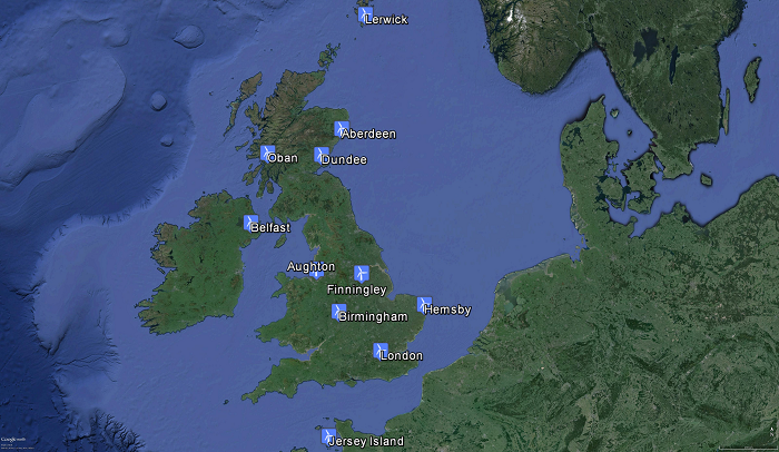
The hardest part of this project was finding reliable data to work with. As most of the people in the industry know, wind speed data for the locations you are working with is the key to these type of analyses. It is also extremely expensive, especially when more detailed data, like hourly or 10 minutes intervals are needed. Most of the data we found was "Velocity Exceedence Curves" on locations throughout the year. It was useful for finding total energy output of a wind turbine. Unfortunately what we needed was wind speeds on every hour of every day. We needed this data to see the correlation between the wind turbine power output and PV power output. We struggled to get this data for a long time and in the end we used Strathclyde’s own software, called ESP-r, to get wind speed data for 11 locations. Those locations were Aberdeen, Aughton, Belfast, Birmingham, Dundee, Finningley, Hemsby, Jersey Island, Lerwick, London and Oban. The detail of the data was hourly, which was easy to work because of the industry standards.
Data Correction
The data was taken from 10m height, we needed to correct the wind speed to hub height of the turbine. The equation we used was
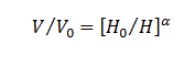
Where “V” is the new speed at the height “H” and “V0” and “Ho” are the wind speed and height of the data taken. “α” is the frictional coefficient related to the surface roughness.
Wind Turbine Power Curve
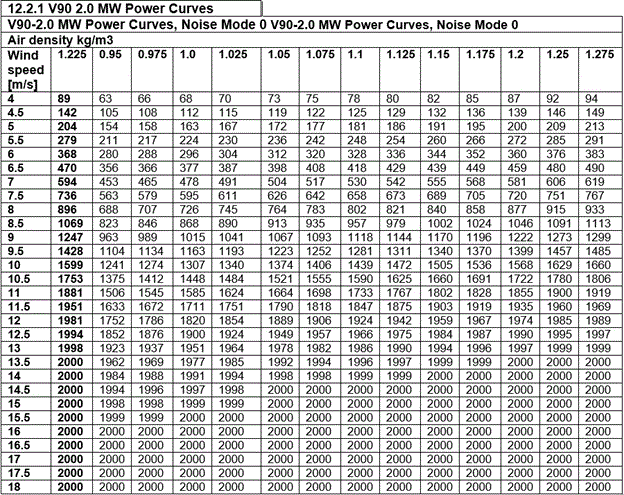
Next thing we did was deciding on what wind turbine to use. We needed to do that in order to get a power curve data, so we can have a hourly power output we can use. We decided to use a "Vestas V90 2.0MW" wind turbine. Our reason for that choice is it's popularity in small scale wind farms and easy access to it's power curve data. We took the power curve data of the turbine from the manufacturer.
Back to top
Analysis
After that, it was just a conversion of the corrected wind speed from the ESP-r software to power output of the turbine. We created a simple spreadsheet to do this conversion, it also helped us to compare the output of the different locations. After we get the power output of the every single location, we started to analyse the results. What we were looking for was hourly correlation between the wind turbine output and PV output. So we looked at the hourly average throughout the year on every location.
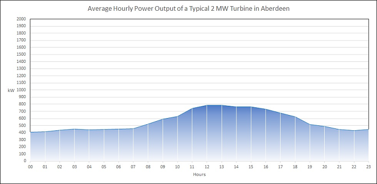
Aberdeen
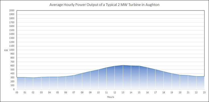
Aughton
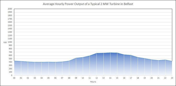
Belfast
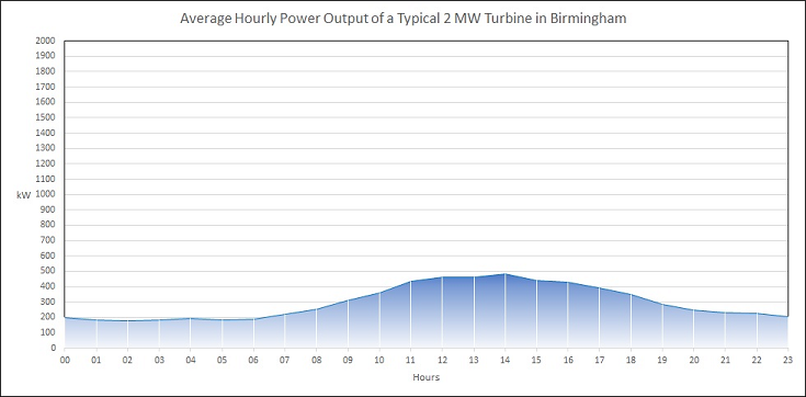
Birmingham
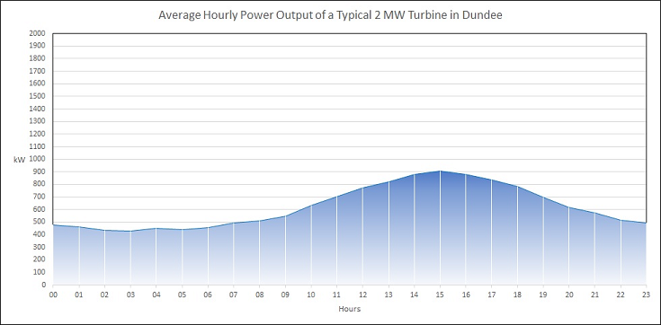
Dundee
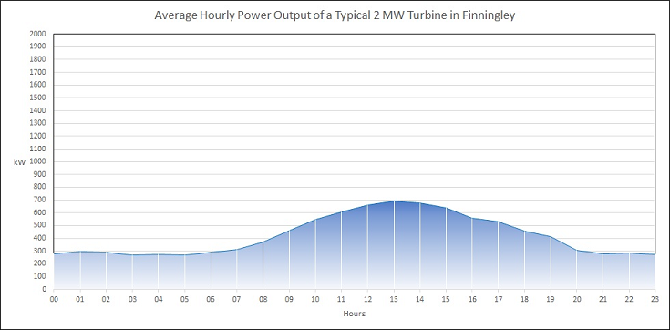
Finnigley
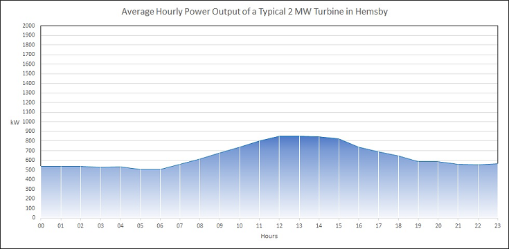
Hemsby
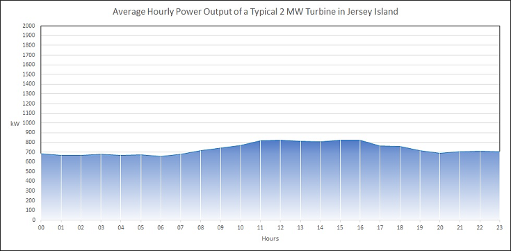
Jersey Island
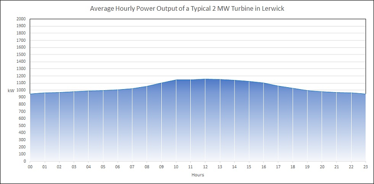
Lerwick
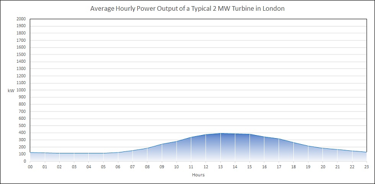
London
Oban
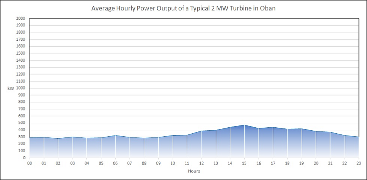
As you can realize from the graphs, there is a trend of a higher power output during daytime hours. We definitely did not expect higher wind speeds during daytime.
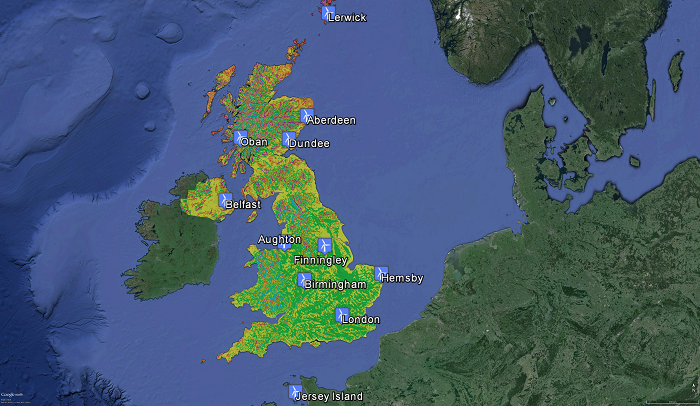
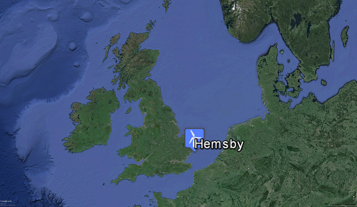
In order to visualise this data, and decide on the location we were going to use, we looked for the wind speed and solar radiation map of the UK.
UK Wind Map
UK Solar Map
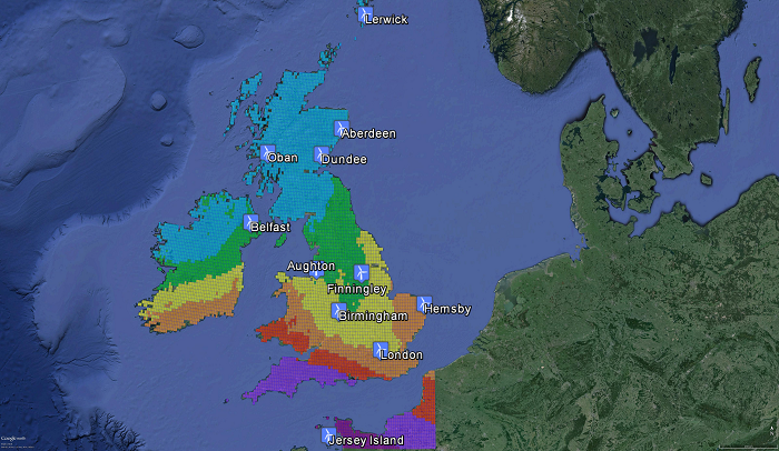
After analysing the data at hand and a simple look at the maps, we realized we needed a location that has a varying wind speed and high solar radiation in order to compensate the power output drop during summer months. Obviously North of UK and Islands have constant wind speeds, which is not favourable for this project. This left us a narrow corridor to work with in the south England. Hemsby was an ideal place to work with. When we checked for the correlation between hourly averages for each month throughout the year, we see a negative correlation between wind and solar. Which is what we were looking for:
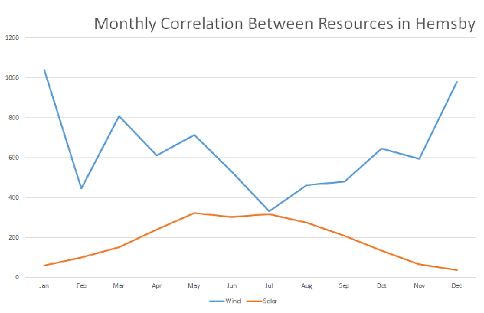
So we ended up with Hemsby:
Back to top
Results
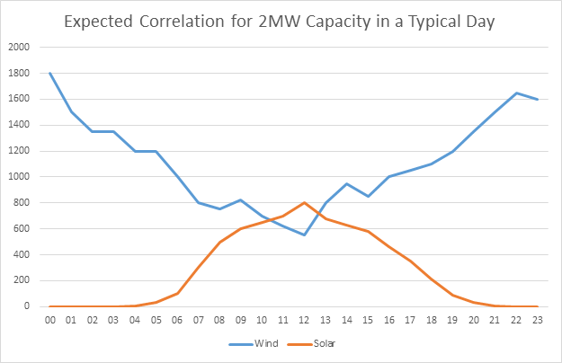
At this point, it is clear that, in general there is going to be a positive correlation between the wind turbine output and PV output. What we wanted to see was a negative correlation between wind and solar, something like this:
Whereas what we ended up was this:
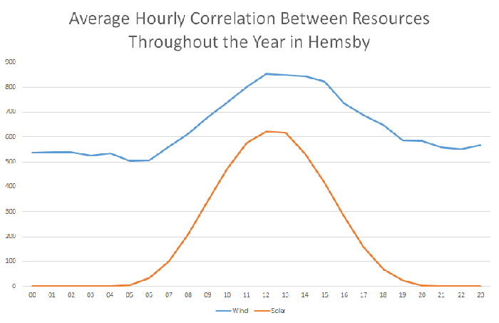
More power output during daytime and less during night. This was not favourable for us to work with. We ended up with a positive correlation whereas we were expecting a negative correlation between wind and solar. Further analysis for the correlation is done under output title.