P. Identifying energy use patterns using 3 D data visualisation
|
Exercise purpose: |
To investigate the use of 3D data visualisation to identify patterns in energy use. |
|||||||||||||||
|
|
|
|||||||||||||||
|
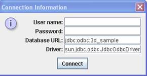
1. Run the 3D data visualisation tool. |
Select '3D pattern' under the 'Exploratory’ menu. Click the 'Connect' button at the initial
pop-up window as seen below.
|
|||||||||||||||
|
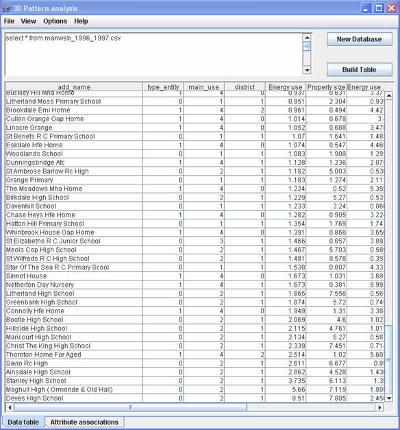
2. Prepare data. |
For the purpose of training, a sample data set is used which consists of schools and social service buildings in a region.
Click the 'Build table' button to call the data set from a file called ‘manweb_1996_1997.csv’ which is located in the folder ‘c:\esru\entrak\sample-data\3d_data’. (There are more sample files available in the folder.)
|
|||||||||||||||
|
|
||||||||||||||||
|
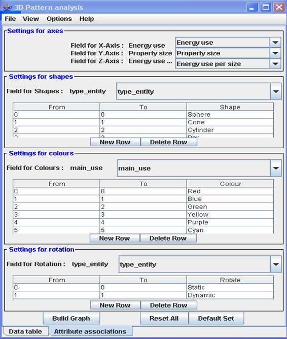
3. Set attributions as default. |
Select the 'Attribute associations'
tab at the bottom to change to 'setting attribution' mode. You can define attribution
of entities to be displayed in the 3D space. Select values for each item
as below. Axis assignment X axis : Energy use (i.e. total electricity consumption, kWh/year) Y axis : Property size (i.e. volume requiring heating, m3) Z axis: Energy use per size (i.e. electricity use per unit heating
volume, kWh / year m3)
Alternatively, you can use
the pre-defined attribution by clicking the 'Default set' button at the bottom of the
'Attribute associations' window. Make sure to select ‘main_use’
in ‘field for colours’. The default attribution sets
it as ‘entity_type’ initially.
|
|||||||||||||||
|
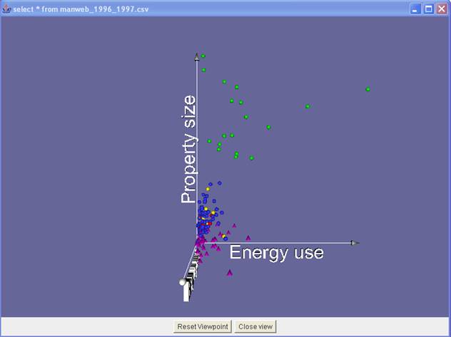
4. View the result of 3D graph. |
To view the 3D outcome, click 'Build graph' button at the bottom of the 'Attribute associations' window.
|
|||||||||||||||
|
|
To resize a window, drag the window edges. |
|||||||||||||||
|
To shift the view, drag the mouse in the desired direction while pressing the left button. |
||||||||||||||||
|
To change the axis angle, drag the mouse while pressing the right button. |
||||||||||||||||
|
To zoom in/out, press the 'Alt' key and drag the mouse while pressing the left button.
|
||||||||||||||||
|
5. Interpretation. |
You can interpret the
outcome. Here is an example. The secondary schools
(green) have larger heating volumes than other educational properties (sphere
shape). The reason for the pattern is because the secondary schools possess more
facilities than the other educational properties. Other groups of educational
properties such as infant schools (red ), primary
schools (blue) and junior schools (green) are located in a spatial cluster
near the origin.
|
|||||||||||||||
|
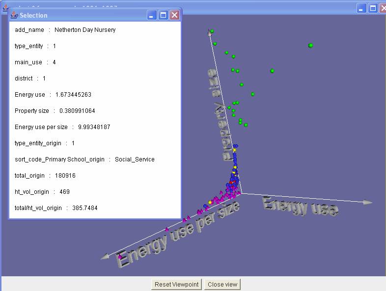
6.Identify the detailed information of an entity. |
You can identify an entity
in the 3D view. The entity selected below
shows the following information: Name : Netherton
Day Nursery Type_entity: 1 (1.e. social service) Main_use: 4(i.e. social service) Energy use: 180,916 kWh/year
Volume: 469 m3 Energy per use: 385.7 kWh/year
m3 Note that the values of ‘energy
use’, ‘property size’ and ‘energy use per size’ in the figure below are meaningless since they
are re-scaled and used for only 3D visualisation.
|
|||||||||||||||
|
|
|
|||||||||||||||
|
Exercise result: |
Ability to operate the 3D visualisation tool. |